Imagined Possibilities....
&
Fashion
Costume
Concepts.
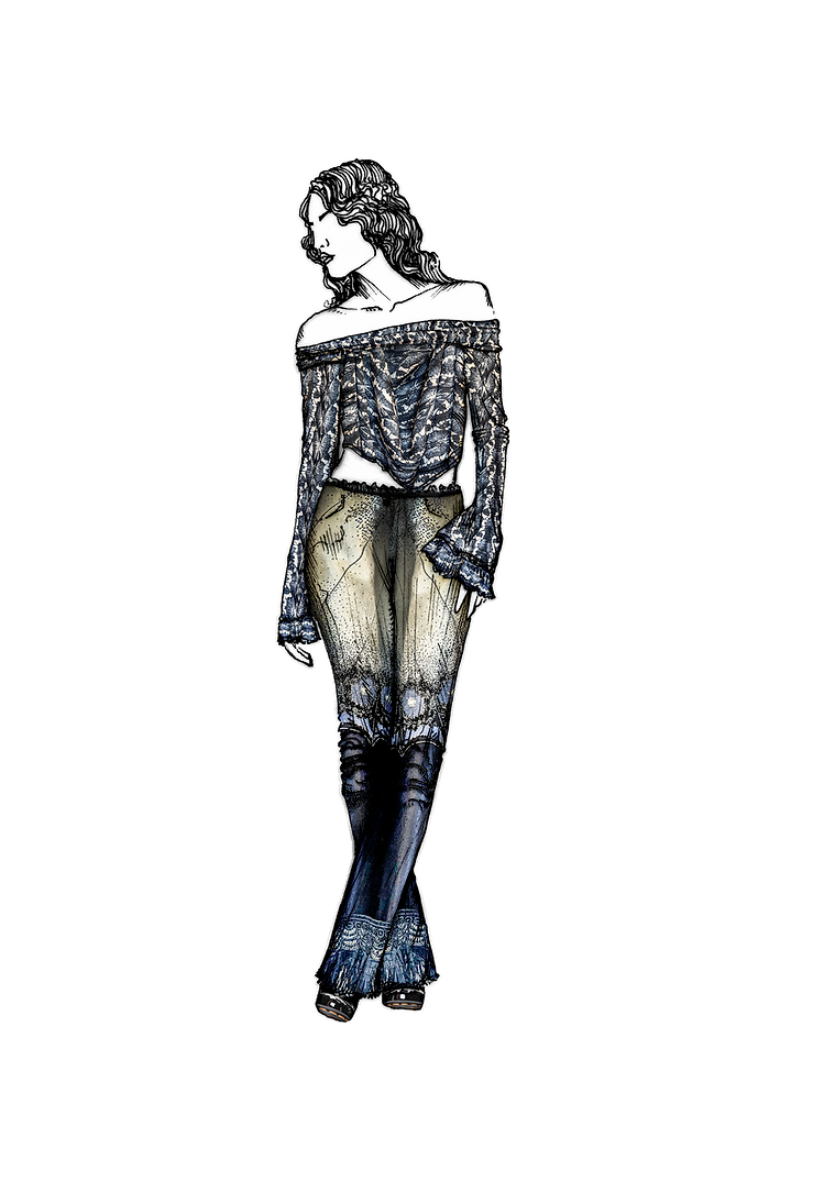
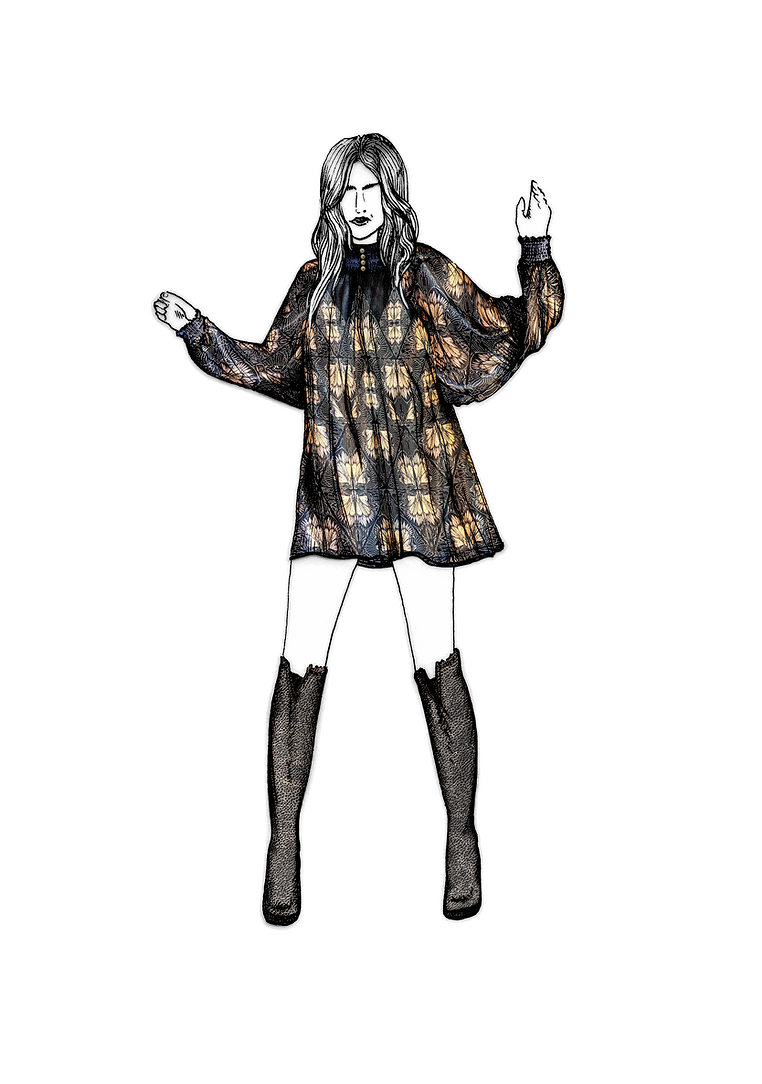
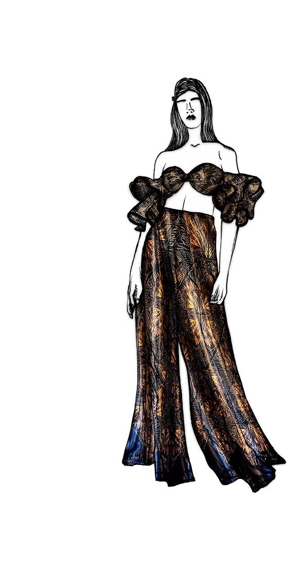
The Collection shows a wide range of patterns - from two tone prints at a small scale to statement prints that envelop the body.
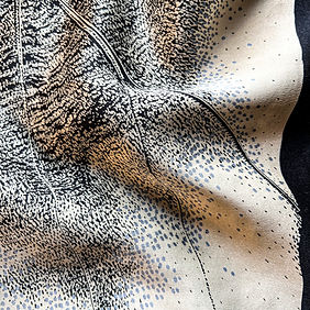
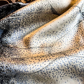
The pieces are intended to be gender neutral, but also celebrate the dramatic and ornate motifs found on butterfly wings - weather that be to camouflage or to attract attention with pops of colour.

Some of the designs are developed from small sample prints, while others are taken from larger pieces of fabric. Throughout my concept development (and within the time available to use the university facilities) I couldn't produce enough of each particular design to make full garments.
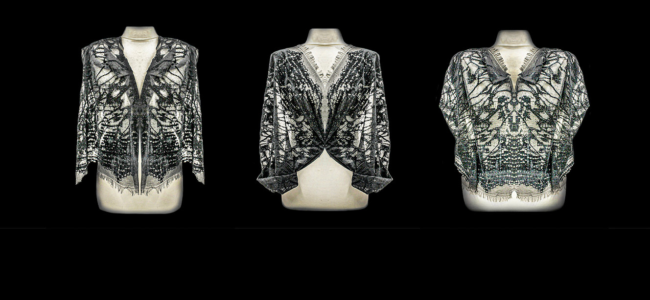
These pieces (above) are conceptualised by pinning the fabric on a manakin and digitally manipulating to create a garment like form.
Creating a negative image from my hand drawn stencil allowed me to remove colour from black silks using a VAT paste. I hand drew a detail/highlight screen to print colours back into my design, the screens work together to create a blend of marks and colours.


Scroll through to see some of the ideas and intentions for the fabrics I created during my final major project at University.
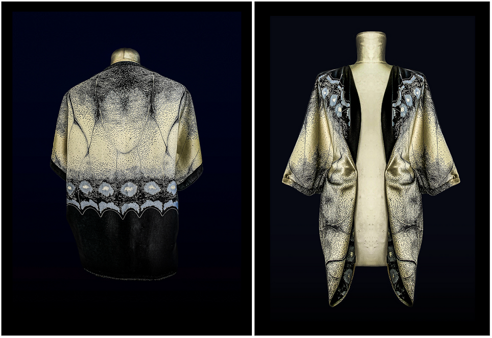
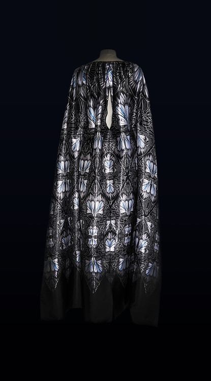
I worked with a variety of fabrics including deadstock silks donated from Alexander McQueen - inspired by the butterfly collection designed by Sarah Burton for Autumn/Winter 2018 - aiming for theatrical shapes, gender neural colour-ways and flowing, supple fabric qualities.
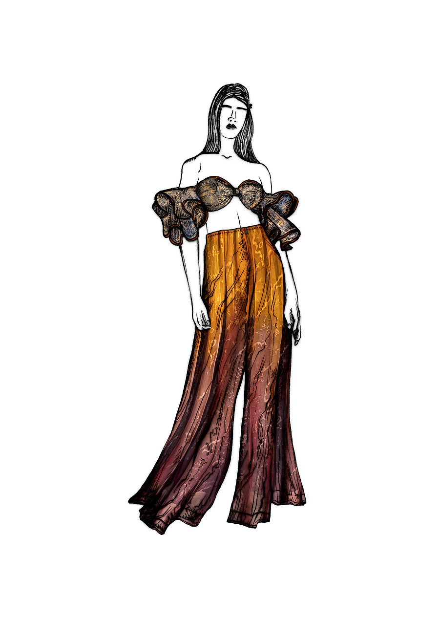
Vat Prints onto light Habotai silk & satin


Coordinating Pantsuits & Shirts


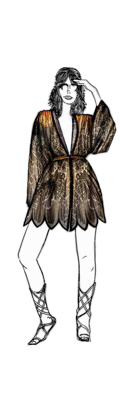
KIMONOS & ROBES


GEOMETRIC DIGITAL PRINT ONTO SATIN


Floating & Sheer
Recently I have reimagined more outfits with the hope of expressing different ideas for each fabric design.
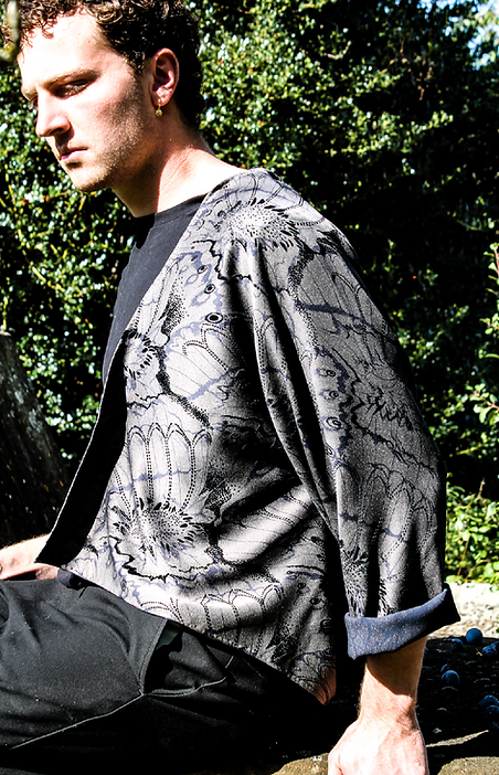
These are largely feminine clothing designs but I believe, in 2025, there are more men willing to experiment with pattern and feminine softness, especially within the arts, music and performance spaces.
I wold love to have experimented with more devoré fabric techniques, as the capacity for overlaying colours and designs on incredibly lightweight fabric (using the separate dyes for cotton and silk fibres) could create some beautifully complex patterns and delicate marks.


Devoré


FLOCK FIBRE APPLICATIONS
This piece of slightly elasticated silk was a deep navy originally, and when a VAT paste was applied using a negative stencil (below right) the colour stripped back to reveal this shimmering silver.
The steam and wash off process of dyeing the silk meant that the base fabric shrunk back, meaning the flock screen/flock detail layer did not align precisely with the design artwork below, although not as intended, this piece of fabric ended up with a greatly balanced sense of flow and space.

flocking on sheer fabric

Throughout my project development I consistently returned to flock fibre experiments, printing with glue and combining different designs to create a variety of textural qualities. Noticing that adding too much flock and glue to certain fabrics made them rigid, I experimented with stripping back the designs and using fine mark making to ensure that the fabric stayed supple and malleable.


.jpg)
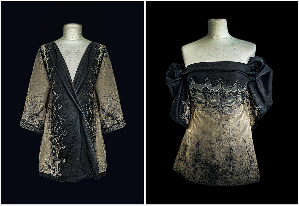
My intention for the collection was to create reversible garments, creating multi - functioning pieces that could be both subtle and camouflaged when worn one way, and then reversed into dramatic and eye catching prints.
My primary focus was the design of these prints, instead of the physical pattern and structure of how to create a reversible garment. When screen printing, it was tricky to isolate prints onto one side of a fabric without it bleeding through the the reverse side, especially working with lightweight silks. The reversibility would be achieved instead by sewing together two separate prints.
Gender - Neutral

Gothic
&
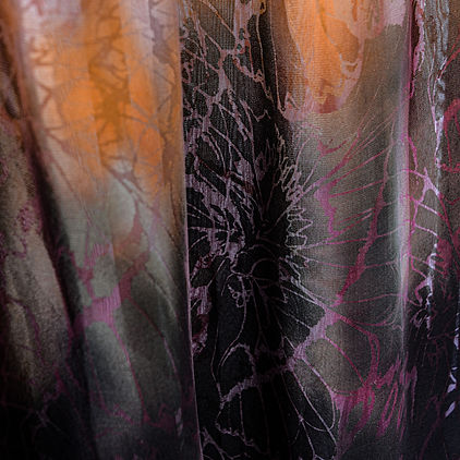
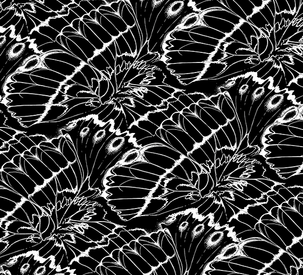
Although the subject of butterflies does usually conjure shimmering colours - luminous blues and warm oranges - black is consistently present, forming their bodies and the veins of their wings.
These coordinate prints use soft cream and high contrast, highlighting the sections, shapes and structure of the fluttering wings.


Camouflage
Designs


Digital Prints
Colourways
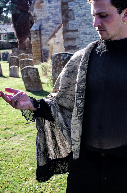
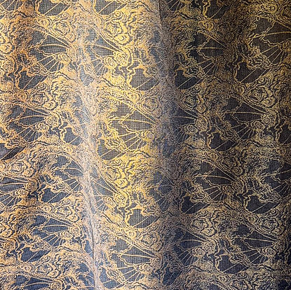
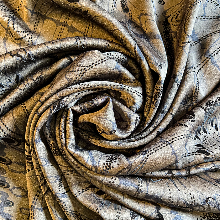
Altogether I only designed 3 pieces of Jacquard, with the most successful being the gold/black design as it felt so luxurious - owing to the slight sheen of the gold thread. (above)
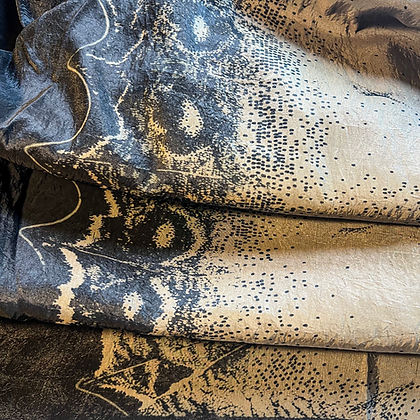
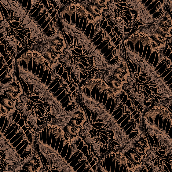
The orange/brown design (right) was finished using a brown dip die to replicate the smooth fades within butterfly wings. This fading of the colours into one aimed to create a camouflaged feel, softening the contrast of the design into an ochre/brown.
Using Jacquard programming taught me more clearly about what makes a repeat feel more seamless, these designs all used half drop repeats. On reflection, the designs that are more angular with straight lines and triangular forms did not flow as seamlessly as the swooping curves. But the design element that ultimately made the black/gold more effective was the blending structure within the weave, creating a third blending tone within the design.


Learning the software for Jacquard programming allowed me to create fully reversible outcomes, but the specific weave setting only allowed for 2 thread colours, using texture to add tones into the design.
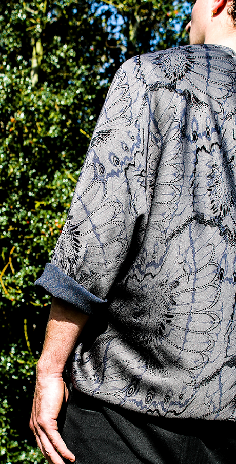
As the Jacquard fabric is the thickest in the collection I naturally started thinking of coats, using the reversibility for cuffs and collars.
Jaquard woven fabric


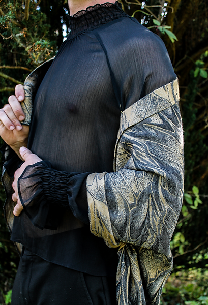


Reversible outwear